
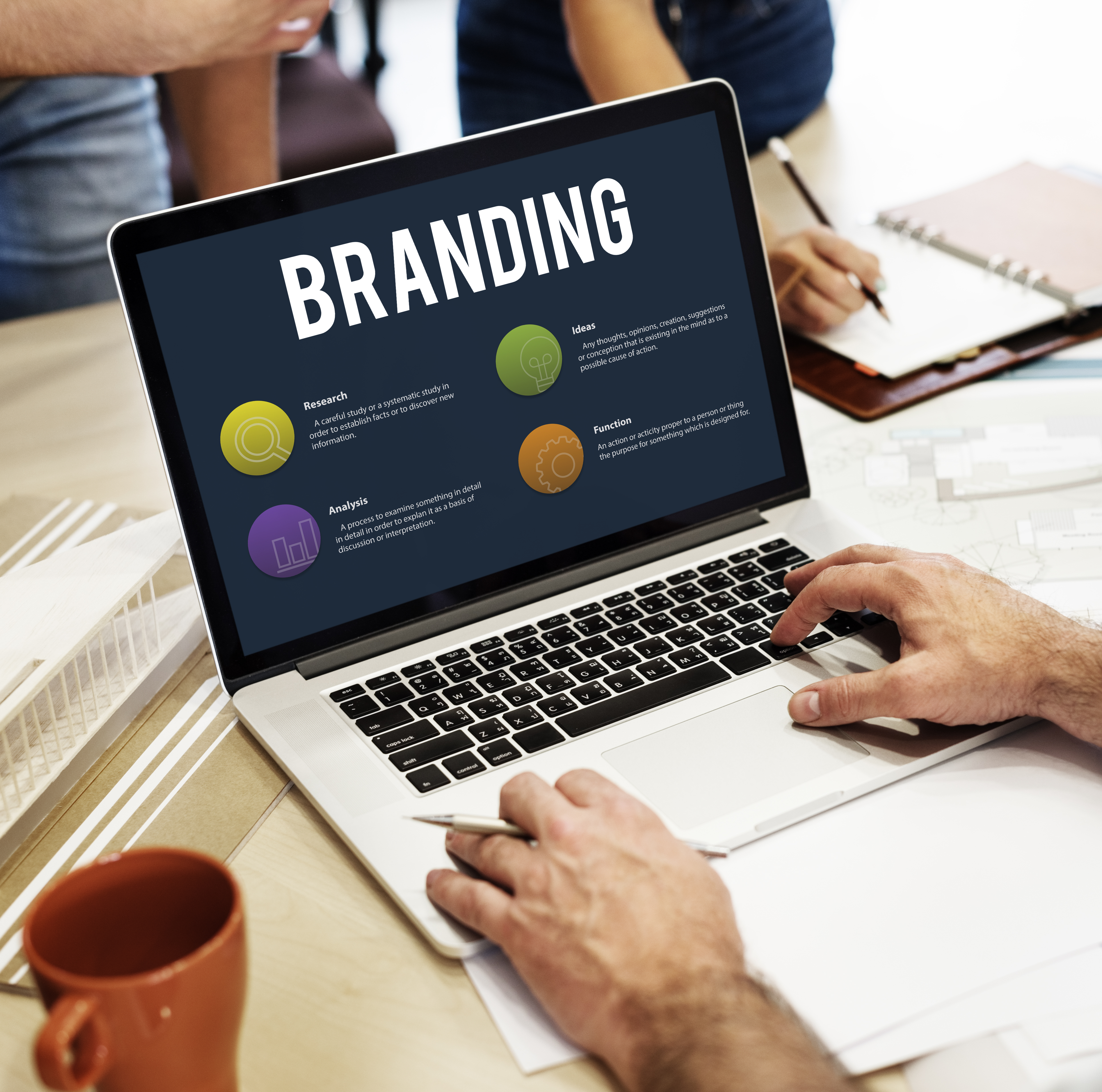
Designing a logo seems easy, but creating one that truly reflects your brand identity and that people remember is a creative process. This process requires strategy and creativity in designing. A logo is not only a symbol, but the face of your business, shaping how viewers and listeners interpret and retain your brand.
This guide shares effective tips to design a logo that’s memorable, reflects your brand identity, and gets noticed. You’ll see real-world examples and how AI logo makers can help create ideas.
Why Some Logos Work (and Others Don’t)
Have you ever asked yourself why certain logos, such as the Apple or Coca-Cola, are easy to remember, whereas other logos are not? It comes down to simplicity, memorability, and relevance.
- Simple and recognizable: A good logo communicates the brand’s message at a glance. It avoids unnecessary details that can confuse viewers, ensuring that the design is easy to recall.
- Memorable: Logos should leave a lasting impression. Unique shapes, clever use of typography, or distinctive visual cues make the design stick in people’s minds.
- Versatile: A logo must work across a variety of platforms and sizes, from small digital icons to large print banners. Scalability and adaptability are essential for consistent branding.
- Timeless: Effective logos are designed to last. They avoid relying solely on trends, so the brand remains relevant without frequent redesigns.
- Relevant: A logo should align with the brand’s personality, values, and target audience. It needs to resonate with viewers and accurately reflect what the business represents.
Focusing on these elements strengthens your logo and brand identity, helping your business make a lasting impression.
The Secret of a Successful Logo Before Designing it
A logo is more than a pretty symbol; it’s a part of your brand identity system. It should reflect your brand’s values, personality, and audience.
Before designing, ask yourself these questions:
- Who is this brand for?
- What are its core values?
- How does it catch the eye in a crowded market?
Answering these questions ensures your logo is strategic, not just decorative.
The Guide to Analysis of Your Brand Identity like a Pro
Breaking down your brand helps make your logo intentional:
- Define the brand’s mission, values, and personality.
- Know your audience: what resonates with Gen Z, millennials, or older generations..
- Competitors study: know what works and what’s overdone.
Soft inspiration can come from observing iconic brands. A few prime examples are Coca-Cola and Apple: their logos perfectly reflect brand personality and audience expectations. Apple’s minimalist Apple shape and Coca-Cola’s flowing script are simple yet highly expressive. This demonstrates that a logo can be iconic without copying anyone else.
To speed up brainstorming, you can explore initial ideas using AI-assisted tools available online. Think of AI as a creative helper, not the final decision-maker; the magic still comes from your creativity.
5 Design Principles That Make Your Logo Memorable
Even the best ideas need structure. These principles would help you to make your logo professional and appealing:
- Balance: Elements should feel harmonious.
- Repetition: Cohesion is achieved by consistency in shapes, colors, or style.
- Contrast: The most important elements are highlighted and are legible.
- Dominance: Highlight the most important feature of your logo.
- Hierarchy: Guides the viewer’s eye naturally through the design.
These principles help create logos that are polished while leaving room for creativity and experimentation.
How to Design Your Ideal Logo in 10 Steps
Here’s a detailed roadmap for turning ideas into a professional logo:
- Explore Conceptual Icons: Sketch ideas representing your brand’s essence. Abstract shapes can convey emotion. Logos like Netflix or Microsoft prove simplicity can be memorable.
- Experiment with Typography: Try uppercase, lowercase, or handwritten fonts. Uppercase suggests professionalism, while handwritten styles feel approachable. Helvetica Now, Montserrat, Poppins, Avenir Next, Futura, Satoshi, and Playfair Display are popular fonts in 2025-2026.
- Choose Colors Wisely: Use color psychology to reflect your brand’s personality. Red conveys energy (Coca-Cola), blue builds trust (Google, Walmart), and gradients evoke creativity (Instagram). Ensure consistency across media.
- Test Scalability: Your logo must look good anywhere, from tiny app icons to large banners.
- Align and Adjust: Proper spacing and alignment keep your logo professional. Misalignment can make even a strong idea look sloppy.
- Bring Everything Together: Combine icon, color, and typography into a cohesive design. Gather feedback, iterate, and refine. Subtle adjustments in spacing, color shades, or font weight can make a huge difference.
- Iterate and Refine: Even after finalizing a version, test variations. AI logo makers visualize ideas, but your intuition and creativity should guide the final design.
Your logo is the visual ambassador of your brand. Each step should strengthen your logo and brand identity, making your brand memorable.
Typography & Color: Make Your Logo Pop and Stick
The right fonts and colors make all the difference.
- Fonts:
Clean, modern, and versatile options include Helvetica Now, Montserrat, Poppins, Avenir Next, Futura, Satoshi, and Playfair Display. Thoughtfully pair fonts to convey tone and hierarchy.
- Colors:
Use color psychology to communicate your brand’s message. Coca-Cola’s red signals energy, Google’s primary colors suggest playfulness, Instagram’s gradient stimulates creativity, and Nike’s logo shows bold simplicity.
Consistency across all applications strengthens brand recognition.
Avoid These Logo Design Mistakes at All Costs
Even experienced designers make errors. Watch out for these points when designing a brand identity:
- Using too many fonts or colors
- Copying competitors
- Overcomplicating designs
- Ignoring alignment or spacing
- Following trends blindly
How to Apply Your Logo Everywhere Without Losing Impact
A logo gains strength when applied consistently across all touchpoints:
- Websites and social media
- Marketing materials and advertisements
- Product packaging and labels
- Office signage and retail spaces
- Partnerships and collaborations
Need Help? How Typespace Studio Can Upgrade Your Brand Identity
Learning to design a logo can be easier with guidance. Typespace Studio helps refine your brand identity design, offering insights, feedback, and professional execution. Combining design principles, trends, and real-world examples with guided practice transforms concepts into polished, memorable logos faster and smarter.
FAQs
Can I create a logo for free?
Yes. Several AI logo tools online allow you to explore and create ideas for free.
How can I get good at logo design?
By practicing sketching, studying iconic logos, experimenting with colors and fonts, and repeating based on feedback, one can get ahold of designing a good logo.
What should I know before creating a logo?
Before creating a brand logo, understand your brand identity, audience, and competitive landscape.Are AI logo makers reliable?
AI tools are great for brainstorming and testing concepts, but should never replace intentional, human-driven decisions.